New Site Preview
Friday, September 25th, 2015 by Andrew
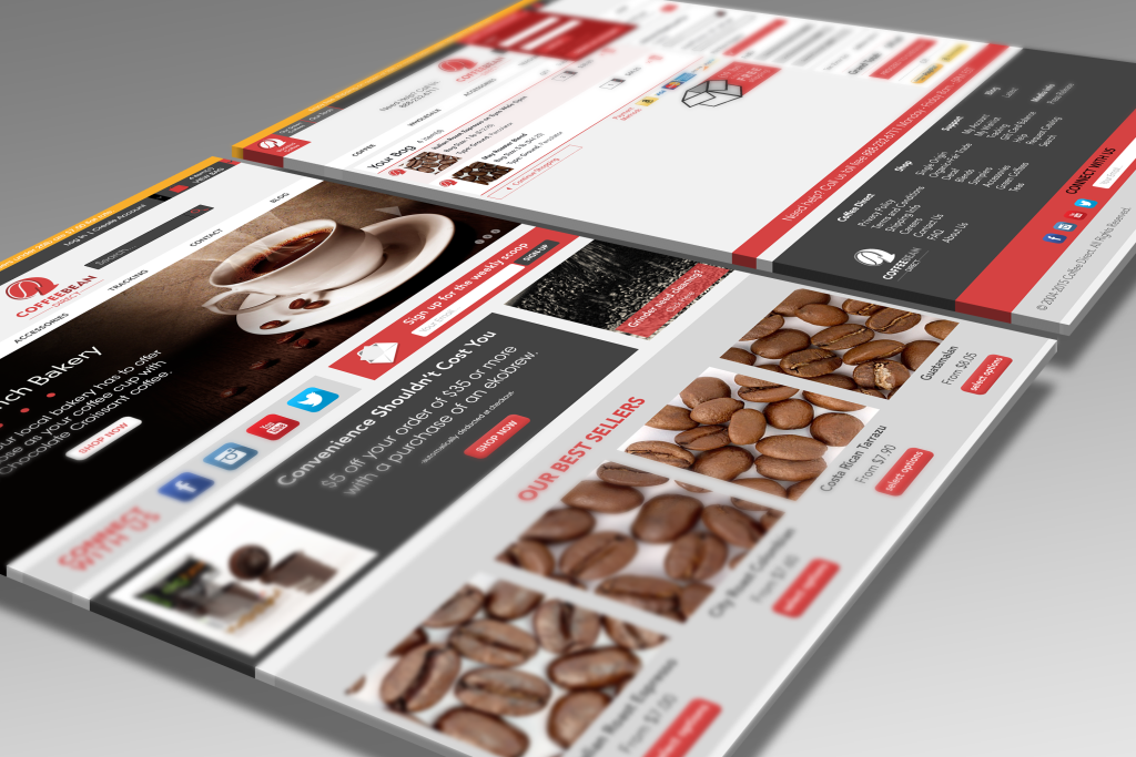
Most of us find change at least mildly irritating, and change is everywhere all the time, so when the search bar on your favorite coffee website is in a new spot, it just might be the little thing that puts you over the edge. Consider this advanced notice: the search bar on our site is moving, and that’s just the beginning. We’ve been hard at work on a new site, which we hope will convince you that change is a wonderful (and beautiful) thing.
Here are some of the key changes you will see on our new site:*
- Responsiveness (aka adaptability). Whether you’re browsing our site on a mobile, tablet, or desktop device, our site will respond to the device you are using. While viewing and shopping is possible on mobile devices using our current site, our new site will be much more mobile-friendly, requiring less scrolling and resizing, making it easy to navigate between products and checkout.
- Easy Navigation. With more options available to you on the home page, you can get where you need to go with fewer clicks.
- Improved searching. You typed Guatamalan. You meant Guatemalan. We know.
- A simplified account page. Instead of navigating between pages while reviewing your account information, your previous orders, written reviews, wishlist, address book, and any gift card balances will all be in one place.
- A user-friendly reviewing process. Were you confused when we mentioned reviews? That’s probably because the “add your review” button is pretty hard to find when browsing our products. Our new site will invite feedback, making it easier to contribute and browse reviews.
- Free shipping countdown. We’re adding a countdown feature to our checkout page so you can keep track of how close your order is to qualifying for free shipping as you add items to your cart.
- A new color scheme. It’s still us, we’re just prettier now.

*Not all of these changes will be implemented at once, but expect to see them soon!
Most of us find change at least mildly irritating, and change is everywhere all the time, so when the search bar on your favorite coffee website is in a new spot, it just might be the little thing that puts you over the edge. Consider this advanced notice: the search bar on our site is moving, and that’s just the beginning. We’ve been hard at work on a new site, which we hope will convince you that change is a wonderful (and beautiful) thing.
Here are some of the key changes you will see on our new site:*
- Responsiveness (aka adaptability). Whether you’re browsing our site on a mobile, tablet, or desktop device, our site will respond to the device you are using. While viewing and shopping is possible on mobile devices using our current site, our new site will be much more mobile-friendly, requiring less scrolling and resizing, making it easy to navigate between products and checkout.
- Easy Navigation. With more options available to you on the home page, you can get where you need to go with fewer clicks.
- Improved searching. You typed Guatamalan. You meant Guatemalan. We know.
- A simplified account page. Instead of navigating between pages while reviewing your account information, your previous orders, written reviews, wishlist, address book, and any gift card balances will all be in one place.
- A user-friendly reviewing process. Were you confused when we mentioned reviews? That’s probably because the “add your review” button is pretty hard to find when browsing our products. Our new site will invite feedback, making it easier to contribute and browse reviews.
- Free shipping countdown. We’re adding a countdown feature to our checkout page so you can keep track of how close your order is to qualifying for free shipping as you add items to your cart.
- A new color scheme. It’s still us, we’re just prettier now.

*Not all of these changes will be implemented at once, but expect to see them soon!


